How to Use
Introduction
GridGUI is a library that allows placing Controls relative to eachother without being limited in the order that they are placed, as well as automatically resizing Controls.
How it works: By adding Controls to an instance of GridGUIClass they will be placed relative to each other so that no row/column will ever be in another although they can have zero area.
You will need: The main source file and the lib directory in the same directory, if you add it to your lib directory then you might want to change the name of the lib directory from this project.
How to use
After inclusion of GridGUI.ahk in a script a GridGUIClass instance can be made like this.
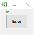
myGui := new GridGUI("Title", Options := "resize")
Show.
myGui.Show()
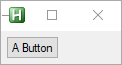
myGui.Add(row := 1, column := 1, type := "Button", options := "", text := "A Button")
Expand
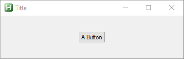
To make the grid cell auto-expand in both height and width, when additional space is available, add the following two arguments.
myGui.Add(1, 1, "Button", , "A Button", exW := 1, exH := 1)
Fill
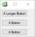
Alternatively, you make it fill out the cells that the control is defined in by using these two arguments. This can be useful when aligning Controls.
myGui.Add(1, 1, "Button", , "A Longer Button")
myGui.Add(1, 2, "Button", , "A Button", , , fillW := 1, fillH := 0)
myGui.Add(1, 3, "Button", , "A Button", , , fillW := 1, fillH := 0)
Auto Resizing Controls
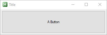
Combining the previous two options makes the Control automatically expand.
myGui.Add(1, 1, "Button", , "A Button", exW := 1, exH := 1, fillW := 1, fillH := 1)
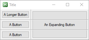
Spanning
When adding a Control it is posible to make it span multriple rows and or columns using a string on the format start-end
#Include <GridGUI>
myGui := new GridGUI("Title", Options := "resize")
myGui.Add(1,    1,      "Button", , "A Longer Button")
myGui.Add(1,    2,      "Button", , "A Button", , , fillW := 1, fillH := 0)
myGui.Add(1,    3,      "Button", , "A Button", , , fillW := 1, fillH := 0)
myGui.Add(2,    "1-3",  "Button", , "An Expanding Button", exW := 1, exH := 1, fillW := 1, fillH := 1)
myGui.Show()

Overlapping Controls
Controls can be put in the same cells. Take care the order that overlapping controls are put into the GridGUI is no longer arbitrary and can affect the resulting look, for instance, if the background image is added before the ActiveX Control in the [url=https://github.com/CapnOdin/GridGUI/blob/master/Examples/Example%20Background.ahk]Backgound Example[/url] the ActiveX Control will not be visible.
myGui.Add("1-3", "1-3", "GroupBox", "w40 h40", "Title", , , 1, 1)
myGui.Add(2, 2, "Button", "w50 h50", "Button", 1, 1, 1, 1)
Justify
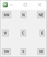
The position of a Control inside of a cell can be set to one of 9 positions by using the Justify parameter.
myGui.Add(1, 1, "Button", {justify:"CN",    text:"N",   exW:1, exH:1})
myGui.Add(1, 1, "Button", {justify:"CNE",   text:"NE",  exW:1, exH:1})
myGui.Add(1, 1, "Button", {justify:"CE",    text:"E",   exW:1, exH:1})
myGui.Add(1, 1, "Button", {justify:"CSE",   text:"SE",  exW:1, exH:1})
myGui.Add(1, 1, "Button", {justify:"CS",    text:"S",   exW:1, exH:1})
myGui.Add(1, 1, "Button", {justify:"CSW",   text:"SW",  exW:1, exH:1})
myGui.Add(1, 1, "Button", {justify:"CW",    text:"W",   exW:1, exH:1})
myGui.Add(1, 1, "Button", {justify:"CNW",   text:"NW",  exW:1, exH:1})
myGui.Add(1, 1, "Button", {justify:"C",     text:"C",   exW:1, exH:1})
Debug
To help debug issues there is an option available when making a GridGUI instance that shows the dividing grid lines.
myGui := new GridGUI("Title", Options := "resize", showGrid := true)
User Input
When adding a Control an instance of ControlClass is returned allowing access to vVars, hwnd and setting up gLabels.
bt := myGui.Add(1, 1, "Button", , "A Button")
bt.callback := Func("ToolTip").Bind("You Pressed the Button")

ToolTip(text) {
    ToolTip, % text
}